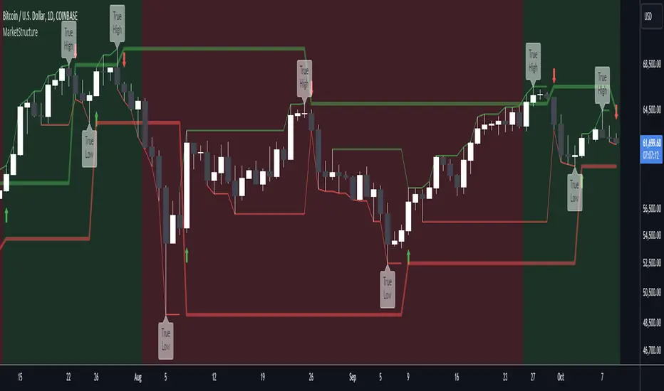
Internal Market StructureInternal Market Structure Indicator (Based on Bearish/Bullish Candle Patterns)
This custom market structure indicator is designed to help traders identify key shifts in market pressure based on bullish and bearish candle patterns. The indicator tracks consecutive bullish and bearish candles and identifies significant points where the price action suggests a potential reversal or continuation of the current market trend.
Key Features:
1. Bullish & Bearish Candle Recognition: The indicator monitors individual candles to determine if they are bullish (close > open) or bearish (close < open), and uses this information to track price direction over consecutive candles.
2. Consecutive Candle Tracking: It tracks consecutive bullish and bearish candles, giving insight into the strength of the prevailing trend. The number of consecutive candles can be adjusted to refine the analysis based on market conditions.
3. Engulfing Candle Detection: The indicator identifies Bullish and Bearish Engulfing signals when a reversal pattern is detected. These are plotted as triangle shapes on the chart:
-Bullish Engulfing: Indicates a potential reversal or continuation of an upward move, where a bullish candle fully engulfs the previous bearish candle.
-Bearish Engulfing: Indicates a potential reversal or continuation of a downward move, where a bearish candle fully engulfs the previous bullish candle.
4. Internal Shifts: The indicator also tracks Internal Shifts, which occur when the price closes beyond the highest or lowest levels of previous bullish or bearish sequences, signaling a potential trend change:
-Bullish Internal Shift: A shift indicating the market may be turning bullish.
-Bearish Internal Shift: A shift indicating the market may be turning bearish.
5. Alerts: Custom alerts are included to notify traders when any of the above conditions are met:
-Bullish Pressure Change Alert
-Bearish Pressure Change Alert
-Bullish Internal Shift Alert
-Bearish Internal Shift Alert
Plotting:
The indicator visually marks these key price levels with shapes on the chart:
-Green Triangle Up: Bullish Engulfment
-Red Triangle Down: Bearish Engulfment
-Blue Triangle Down: Bearish Internal Shift
-Orange Triangle Up: Bullish Internal Shift
Usage:
This indicator can be used to spot potential reversals, continuation patterns, and shifts in market sentiment. Traders can combine these signals with other technical indicators to form a more robust trading strategy.
By focusing on candle patterns and market structure, this indicator offers a clear, actionable framework for understanding market behavior and making more informed trading decisions.
*NOTE*
The polyline and horizontal trend lines drawn are not included in this indicator, but are there to show how this indicator can be used to illustrate the internal market structure of the given timeframe.
Cerca negli script per "market structure"

Dynamic Market Structure DetectorTitle: Dynamic Market Structure Detector – Real-Time BoS & ChoCH Signals
Short Description:
Identify market structure dynamically with real-time Break of Structure (BoS) and Change of Character (ChoCH) signals. Highlight untested support and resistance zones to improve trading precision.
Full Description:
The Dynamic Market Structure Detector is a powerful TradingView indicator designed for traders who want to automate the identification of key market structure levels. This indicator simplifies market analysis by dynamically tracking swing highs and lows, marking critical Break of Structure (BoS) and Change of Character (ChoCH) points, and highlighting untested support and resistance zones.
Key Features:
1. Real-Time Signals:
• Marks Break of Structure (BoS) and Change of Character (ChoCH) points as they occur.
• Automatically updates as the market evolves.
2. Dynamic Swing Highs and Lows:
• Tracks swing highs and lows based on user-defined sensitivity (Swing Length).
• Adjust swing length to tailor signals for intraday or swing trading.
3. Untested Zones Highlight:
• Visualize untested support and resistance zones dynamically.
• Opacity settings allow customization for better chart readability.
4. Customizable Inputs:
• Swing Length:
Adjust the sensitivity of BoS and ChoCH signals.
• Smaller Swing Length values (e.g., 3–5): Capture short-term market movements, ideal for intraday trading.
• Larger Swing Length values (e.g., 10–20): Focus on significant market structure changes for swing or positional trading.
Experiment with these values to find the best fit for your trading style.
• Untested Zone Opacity:
Control the visibility of highlighted support and resistance zones.
• Lower opacity values (e.g., 10–50): Make the zones more prominent, helpful for darker chart backgrounds.
• Higher opacity values (e.g., 70–90): Provide subtle highlights, better suited for lighter chart setups.
• A value of 100% renders the zones completely transparent (invisible).
Use this setting to customize the visual appearance of your chart while still retaining key zone information.
5. User-Friendly Visualization:
• Color-coded labels for BoS (Green) and ChoCH (Red).
• Highlight zones for untested areas using customizable colors (Support: Blue, Resistance: Orange).
Why Use This Indicator?
• Simplifies market structure analysis by automating key calculations.
• Helps traders identify potential trend reversals and continuation points.
• Reduces the need for manual charting, saving time and effort.
• Provides visual clarity on untested zones for better decision-making.
Recommended Usage:
• Intraday Traders: Use smaller Swing Length values (e.g., 3–5) to capture short-term market movements.
• Swing Traders: Opt for higher Swing Length values (e.g., 10–20) to focus on larger market structure changes.
• Monitor untested zones for potential price reactions, enhancing your trade entries and exits.
Notes :
This indicator is best suited for traders who prefer price action trading and market structure analysis. While the indicator provides reliable insights, it is recommended to use it in conjunction with other analysis tools for a holistic trading approach.
Credits:
Developed by TradeTech Analysis to empower traders with automated tools for smarter trading decisions.

The Curved Market Structure [BigBeluga]Curved Market Structure
The Curved Market Structure indicator offers an innovative twist on traditional market structure tools by using curved lines instead of horizontal ones, enabling faster breakout detection for traders.
🔵Key Features:
Curved Market Structure Levels: The indicator identifies high and low pivots and plots curved lines connecting these points, adapting to market dynamics and providing a more intuitive view of potential breakout zones.
Breakout Detection: Breakouts above or below the curved levels are marked with triangle symbols (▲ or ▼), making it easy to spot critical price movements.
Dynamic Target Levels: After a breakout, the indicator plots three target levels, which serve as potential price objectives. Each target is marked with a number and a star (e.g., 1★) upon being reached.
Customizable Line Length and Angle: Users can adjust the length and angle of the curved lines to fit their trading style and timeframe, making the tool versatile and adaptable.
Market Structure Trend Filtering: To maintain a clean chart, the indicator plots curved levels only from high pivots during uptrends and low pivots during downtrends.
🔵How It Works:
The indicator identifies high and low pivots using user-defined parameters (left and right bars).
Curved lines are drawn from these pivot points, showing the structure of the market and potential breakout zones.
When a breakout occurs, the indicator highlights the direction with triangle symbols and dynamically plots three price targets.
Upon reaching these targets, the level is marked with its respective number and a star, helping traders track price progression effectively.
The lines and targets are adjusted based on market conditions, ensuring real-time relevance and accuracy.
🔵Use Cases:
Spotting key breakout zones to identify entry and exit points more effectively.
Setting dynamic target levels for take-profit or stop-loss planning.
Filtering market noise and maintaining a cleaner chart while analyzing trends.
Enhancing traditional market structure analysis with an intuitive curved visualization.
This indicator is ideal for traders who want a modern, dynamic, and visually appealing way to track market structure and breakouts while maintaining chart clarity.
EMA Market Structure [BOSWaves]// This Pine Script™ code is subject to the terms of the Mozilla Public License 2.0 at mozilla.org
// Join our channel for more free tools: t.me
// This Pine Script® code is subject to the terms of the Mozilla Public License 2.0 at mozilla.org
// © BOSWaves
//@version=6
indicator("EMA Market Structure ", overlay=true, max_lines_count=500, max_labels_count=500, max_boxes_count=500)
// ============================================================================
// Inputs
// ============================================================================
// Ema settings
emaLength = input.int(50, "EMA Length", minval=1, tooltip="Period for the Exponential Moving Average calculation")
emaSource = input.source(close, "EMA Source", tooltip="Price source for EMA calculation (close, open, high, low, etc.)")
colorSmooth = input.int(3, "Color Smoothing", minval=1, group="EMA Style", tooltip="Smoothing period for the EMA color gradient transition")
showEmaGlow = input.bool(true, "EMA Glow Effect", group="EMA Style", tooltip="Display glowing halo effect around the EMA line for enhanced visibility")
// Structure settings
swingLength = input.int(5, "Swing Detection Length", minval=2, group="Structure", tooltip="Number of bars to the left and right to identify swing highs and lows")
swingCooloff = input.int(10, "Swing Marker Cooloff (Bars)", minval=1, group="Structure", tooltip="Minimum number of bars between consecutive swing point markers to reduce visual clutter")
showSwingLines = input.bool(true, "Show Structure Lines", group="Structure", tooltip="Display lines connecting swing highs and swing lows")
showSwingZones = input.bool(true, "Show Structure Zones", group="Structure", tooltip="Display shaded zones between consecutive swing points")
showBOS = input.bool(true, "Show Break of Structure", group="Structure", tooltip="Display BOS labels and stop loss levels when price breaks structure")
bosCooloff = input.int(15, "BOS Cooloff (Bars)", minval=5, maxval=50, group="Structure", tooltip="Minimum number of bars required between consecutive BOS signals to avoid signal spam")
slExtension = input.int(20, "SL Line Extension (Bars)", minval=5, maxval=100, group="Structure", tooltip="Number of bars to extend the stop loss line into the future for visibility")
slBuffer = input.float(0.1, "SL Buffer %", minval=0, maxval=2, step=0.05, group="Structure", tooltip="Additional buffer percentage to add to stop loss level for safety margin")
// Background settings
showBG = input.bool(true, "Show Trend Background", group="EMA Style", tooltip="Display background color based on EMA trend direction")
bgBullColor = input.color(color.new(#00ff88, 96), "Bullish BG", group="EMA Style", tooltip="Background color when EMA is in bullish trend")
bgBearColor = input.color(color.new(#ff3366, 96), "Bearish BG", group="EMA Style", tooltip="Background color when EMA is in bearish trend")
// ============================================================================
// Ema trend filter with gradient color
// ============================================================================
ema = ta.ema(emaSource, emaLength)
// Calculate EMA acceleration for gradient color
emaChange = ema - ema
emaAccel = ta.ema(emaChange, colorSmooth)
// Manual tanh function for normalization
tanh(x) =>
ex = math.exp(2 * x)
(ex - 1) / (ex + 1)
accelNorm = tanh(emaAccel / (ta.atr(14) * 0.01))
// Map normalized accel to hue (60 = green, 120 = yellow/red)
hueRaw = 60 + accelNorm * 60
hue = na(hueRaw ) ? hueRaw : (hueRaw + hueRaw ) / 2
sat = 1.0
val = 1.0
// HSV to RGB conversion
hsv_to_rgb(h, s, v) =>
c = v * s
x = c * (1 - math.abs((h / 60) % 2 - 1))
m = v - c
r = 0.0
g = 0.0
b = 0.0
if (h < 60)
r := c
g := x
b := 0
else if (h < 120)
r := x
g := c
b := 0
else if (h < 180)
r := 0
g := c
b := x
else if (h < 240)
r := 0
g := x
b := c
else if (h < 300)
r := x
g := 0
b := c
else
r := c
g := 0
b := x
color.rgb(int((r + m) * 255), int((g + m) * 255), int((b + m) * 255))
emaColor = hsv_to_rgb(hue, sat, val)
emaTrend = ema > ema ? 1 : ema < ema ? -1 : 0
// EMA with enhanced glow effect using fills
glowOffset = ta.atr(14) * 0.25
emaGlow8 = plot(showEmaGlow ? ema + glowOffset * 8 : na, "EMA Glow 8", color.new(emaColor, 100), 1, display=display.none)
emaGlow7 = plot(showEmaGlow ? ema + glowOffset * 7 : na, "EMA Glow 7", color.new(emaColor, 100), 1, display=display.none)
emaGlow6 = plot(showEmaGlow ? ema + glowOffset * 6 : na, "EMA Glow 6", color.new(emaColor, 100), 1, display=display.none)
emaGlow5 = plot(showEmaGlow ? ema + glowOffset * 5 : na, "EMA Glow 5", color.new(emaColor, 100), 1, display=display.none)
emaGlow4 = plot(showEmaGlow ? ema + glowOffset * 4 : na, "EMA Glow 4", color.new(emaColor, 100), 1, display=display.none)
emaGlow3 = plot(showEmaGlow ? ema + glowOffset * 3 : na, "EMA Glow 3", color.new(emaColor, 100), 1, display=display.none)
emaGlow2 = plot(showEmaGlow ? ema + glowOffset * 2 : na, "EMA Glow 2", color.new(emaColor, 100), 1, display=display.none)
emaGlow1 = plot(showEmaGlow ? ema + glowOffset * 1 : na, "EMA Glow 1", color.new(emaColor, 100), 1, display=display.none)
emaCore = plot(ema, "EMA Core", emaColor, 3)
emaGlow1b = plot(showEmaGlow ? ema - glowOffset * 1 : na, "EMA Glow 1b", color.new(emaColor, 100), 1, display=display.none)
emaGlow2b = plot(showEmaGlow ? ema - glowOffset * 2 : na, "EMA Glow 2b", color.new(emaColor, 100), 1, display=display.none)
emaGlow3b = plot(showEmaGlow ? ema - glowOffset * 3 : na, "EMA Glow 3b", color.new(emaColor, 100), 1, display=display.none)
emaGlow4b = plot(showEmaGlow ? ema - glowOffset * 4 : na, "EMA Glow 4b", color.new(emaColor, 100), 1, display=display.none)
emaGlow5b = plot(showEmaGlow ? ema - glowOffset * 5 : na, "EMA Glow 5b", color.new(emaColor, 100), 1, display=display.none)
emaGlow6b = plot(showEmaGlow ? ema - glowOffset * 6 : na, "EMA Glow 6b", color.new(emaColor, 100), 1, display=display.none)
emaGlow7b = plot(showEmaGlow ? ema - glowOffset * 7 : na, "EMA Glow 7b", color.new(emaColor, 100), 1, display=display.none)
emaGlow8b = plot(showEmaGlow ? ema - glowOffset * 8 : na, "EMA Glow 8b", color.new(emaColor, 100), 1, display=display.none)
// Create glow layers with fills (from outermost to innermost)
fill(emaGlow8, emaGlow7, showEmaGlow ? color.new(emaColor, 97) : na)
fill(emaGlow7, emaGlow6, showEmaGlow ? color.new(emaColor, 95) : na)
fill(emaGlow6, emaGlow5, showEmaGlow ? color.new(emaColor, 93) : na)
fill(emaGlow5, emaGlow4, showEmaGlow ? color.new(emaColor, 90) : na)
fill(emaGlow4, emaGlow3, showEmaGlow ? color.new(emaColor, 87) : na)
fill(emaGlow3, emaGlow2, showEmaGlow ? color.new(emaColor, 83) : na)
fill(emaGlow2, emaGlow1, showEmaGlow ? color.new(emaColor, 78) : na)
fill(emaGlow1, emaCore, showEmaGlow ? color.new(emaColor, 70) : na)
fill(emaCore, emaGlow1b, showEmaGlow ? color.new(emaColor, 70) : na)
fill(emaGlow1b, emaGlow2b, showEmaGlow ? color.new(emaColor, 78) : na)
fill(emaGlow2b, emaGlow3b, showEmaGlow ? color.new(emaColor, 83) : na)
fill(emaGlow3b, emaGlow4b, showEmaGlow ? color.new(emaColor, 87) : na)
fill(emaGlow4b, emaGlow5b, showEmaGlow ? color.new(emaColor, 90) : na)
fill(emaGlow5b, emaGlow6b, showEmaGlow ? color.new(emaColor, 93) : na)
fill(emaGlow6b, emaGlow7b, showEmaGlow ? color.new(emaColor, 95) : na)
fill(emaGlow7b, emaGlow8b, showEmaGlow ? color.new(emaColor, 97) : na)
// ============================================================================
// Swing high/low detection
// ============================================================================
// Swing High/Low Detection
swingHigh = ta.pivothigh(high, swingLength, swingLength)
swingLow = ta.pivotlow(low, swingLength, swingLength)
// Cooloff tracking
var int lastSwingHighPlot = na
var int lastSwingLowPlot = na
// Check if cooloff period has passed
canPlotHigh = na(lastSwingHighPlot) or (bar_index - lastSwingHighPlot) >= swingCooloff
canPlotLow = na(lastSwingLowPlot) or (bar_index - lastSwingLowPlot) >= swingCooloff
// Store swing points
var float lastSwingHigh = na
var int lastSwingHighBar = na
var float lastSwingLow = na
var int lastSwingLowBar = na
// Track previous swing for BOS detection
var float prevSwingHigh = na
var float prevSwingLow = na
// Update swing highs with cooloff
if not na(swingHigh) and canPlotHigh
prevSwingHigh := lastSwingHigh
lastSwingHigh := swingHigh
lastSwingHighBar := bar_index - swingLength
lastSwingHighPlot := bar_index
// Update swing lows with cooloff
if not na(swingLow) and canPlotLow
prevSwingLow := lastSwingLow
lastSwingLow := swingLow
lastSwingLowBar := bar_index - swingLength
lastSwingLowPlot := bar_index
// ============================================================================
// Structure lines & zones
// ============================================================================
var line swingHighLine = na
var line swingLowLine = na
var box swingHighZone = na
var box swingLowZone = na
if showSwingLines
// Draw line connecting swing highs with zones
if not na(swingHigh) and canPlotHigh and not na(prevSwingHigh)
if not na(lastSwingHighBar)
line.delete(swingHighLine)
swingHighLine := line.new(lastSwingHighBar, lastSwingHigh, bar_index - swingLength, swingHigh, color=color.new(#ff3366, 0), width=2, style=line.style_solid)
// Create resistance zone
if showSwingZones
box.delete(swingHighZone)
zoneTop = math.max(lastSwingHigh, swingHigh)
zoneBottom = math.min(lastSwingHigh, swingHigh)
swingHighZone := box.new(lastSwingHighBar, zoneTop, bar_index - swingLength, zoneBottom, border_color=color.new(#ff3366, 80), bgcolor=color.new(#ff3366, 92))
// Draw line connecting swing lows with zones
if not na(swingLow) and canPlotLow and not na(prevSwingLow)
if not na(lastSwingLowBar)
line.delete(swingLowLine)
swingLowLine := line.new(lastSwingLowBar, lastSwingLow, bar_index - swingLength, swingLow, color=color.new(#00ff88, 0), width=2, style=line.style_solid)
// Create support zone
if showSwingZones
box.delete(swingLowZone)
zoneTop = math.max(lastSwingLow, swingLow)
zoneBottom = math.min(lastSwingLow, swingLow)
swingLowZone := box.new(lastSwingLowBar, zoneTop, bar_index - swingLength, zoneBottom, border_color=color.new(#00ff88, 80), bgcolor=color.new(#00ff88, 92))
// ============================================================================
// Break of structure (bos)
// ============================================================================
// Track last BOS bar for cooloff
var int lastBullishBOS = na
var int lastBearishBOS = na
// Check if cooloff period has passed
canPlotBullishBOS = na(lastBullishBOS) or (bar_index - lastBullishBOS) >= bosCooloff
canPlotBearishBOS = na(lastBearishBOS) or (bar_index - lastBearishBOS) >= bosCooloff
// Bullish BOS: Price breaks above previous swing high while EMA is bullish
bullishBOS = showBOS and canPlotBullishBOS and emaTrend == 1 and not na(prevSwingHigh) and close > prevSwingHigh and close <= prevSwingHigh
// Bearish BOS: Price breaks below previous swing low while EMA is bearish
bearishBOS = showBOS and canPlotBearishBOS and emaTrend == -1 and not na(prevSwingLow) and close < prevSwingLow and close >= prevSwingLow
// Update last BOS bars
if bullishBOS
lastBullishBOS := bar_index
if bearishBOS
lastBearishBOS := bar_index
// Plot BOS with enhanced visuals and SL at the candle wick
if bullishBOS
// Calculate SL at the low of the current candle (bottom of wick) with buffer
slLevel = low * (1 - slBuffer/100)
// BOS Label with shadow effect
label.new(bar_index, low, "BOS", style=label.style_label_up, color=color.new(#00ff88, 0), textcolor=color.black, size=size.normal, tooltip="Bullish Break of Structure\nSL: " + str.tostring(slLevel))
// Main SL line at candle low
line.new(bar_index, slLevel, bar_index + slExtension, slLevel, color=color.new(#00ff88, 0), width=2, style=line.style_dashed, extend=extend.none)
// SL zone box for visual emphasis
box.new(bar_index, slLevel + (slLevel * 0.002), bar_index + slExtension, slLevel - (slLevel * 0.002), border_color=color.new(#00ff88, 60), bgcolor=color.new(#00ff88, 85))
// S/R label
label.new(bar_index + slExtension, slLevel, "S/R", style=label.style_label_left, color=color.new(#00ff88, 0), textcolor=color.black, size=size.tiny)
if bearishBOS
// Calculate SL at the high of the current candle (top of wick) with buffer
slLevel = high * (1 + slBuffer/100)
// BOS Label with shadow effect
label.new(bar_index, high, "BOS", style=label.style_label_down, color=color.new(#ff3366, 0), textcolor=color.white, size=size.normal, tooltip="Bearish Break of Structure\nSL: " + str.tostring(slLevel))
// Main SL line at candle high
line.new(bar_index, slLevel, bar_index + slExtension, slLevel, color=color.new(#ff3366, 0), width=2, style=line.style_dashed, extend=extend.none)
// SL zone box for visual emphasis
box.new(bar_index, slLevel + (slLevel * 0.002), bar_index + slExtension, slLevel - (slLevel * 0.002), border_color=color.new(#ff3366, 60), bgcolor=color.new(#ff3366, 85))
// S/R label
label.new(bar_index + slExtension, slLevel, "S/R", style=label.style_label_left, color=color.new(#ff3366, 0), textcolor=color.white, size=size.tiny)
// ============================================================================
// Dynamic background zones
// ============================================================================
bgcolor(showBG and emaTrend == 1 ? bgBullColor : showBG and emaTrend == -1 ? bgBearColor : na)
// ============================================================================
// Alerts
// ============================================================================
alertcondition(bullishBOS, "Bullish BOS", "Bullish Break of Structure detected!")
alertcondition(bearishBOS, "Bearish BOS", "Bearish Break of Structure detected!")
alertcondition(emaTrend == 1 and emaTrend != 1, "EMA Bullish", "EMA turned bullish")
alertcondition(emaTrend == -1 and emaTrend != -1, "EMA Bearish", "EMA turned bearish")
// ╔════════════════════════════════╗
// ║ Download at ║
// ╚════════════════════════════════╝
// ███████╗██╗███╗ ███╗██████╗ ██╗ ███████╗
// ██╔════╝██║████╗ ████║██╔══██╗██║ ██╔════╝
// ███████╗██║██╔████╔██║██████╔╝██║ █████╗
// ╚════██║██║██║╚██╔╝██║██╔═══╝ ██║ ██╔══╝
// ███████║██║██║ ╚═╝ ██║██║ ███████╗███████╗
// ╚══════╝╚═╝╚═╝ ╚═╝╚═╝ ╚══════╝╚══════╝
// ███████╗ ██████╗ ██████╗ ███████╗██╗ ██╗
// ██╔════╝██╔═══██╗██╔══██╗██╔════╝╚██╗██╔╝
// █████╗ ██║ ██║██████╔╝█████╗ ╚███╔╝
// ██╔══╝ ██║ ██║██╔══██╗██╔══╝ ██╔██╗
// ██║ ╚██████╔╝██║ ██║███████╗██╔╝ ██╗
// ╚═╝ ╚═════╝ ╚═╝ ╚═╝╚══════╝╚═╝ ╚═╝
// ████████╗ ██████╗ ██████╗ ██╗ ███████╗
// ╚══██╔══╝██╔═══██╗██╔═══██╗██║ ██╔════╝
// ██║ ██║ ██║██║ ██║██║ ███████╗
// ██║ ██║ ██║██║ ██║██║ ╚════██║
// ██║ ╚██████╔╝╚██████╔╝███████╗███████║
// ╚═╝ ╚═════╝ ╚═════╝ ╚══════╝╚══════╝
// ==========================================================================================

FVG & Market Structure//@version=5
indicator("FVG & Market Structure", overlay=true)
// Inputs
fvg_lookback = input.int(100, "FVG Lookback Period")
fvg_strength = input.int(1, "FVG Minimum Strength")
show_fvg = input.bool(true, "Show FVG")
show_liquidity = input.bool(true, "Show Liquidity Zones")
show_bos = input.bool(true, "Show BOS")
// Calculate swing highs and lows
swing_high = ta.pivothigh(high, 2, 2)
swing_low = ta.pivotlow(low, 2, 2)
// Detect Fair Value Gaps (FVG)
detect_fvg() =>
// Bullish FVG (current low > previous high + threshold)
bullish_fvg = low > high and show_fvg
// Bearish FVG (current high < previous low - threshold)
bearish_fvg = high < low and show_fvg
= detect_fvg()
// Plot FVG areas
bgcolor(bullish_fvg ? color.new(color.green, 95) : na, title="Bullish FVG")
bgcolor(bearish_fvg ? color.new(color.red, 95) : na, title="Bearish FVG")
// Breach of Structure (BOS) detection
detect_bos() =>
var bool bull_bos = false
var bool bear_bos = false
// Bullish BOS - price breaks above previous swing high
if high > ta.valuewhen(swing_high, high, 1) and not na(swing_high)
bull_bos := true
bear_bos := false
// Bearish BOS - price breaks below previous swing low
if low < ta.valuewhen(swing_low, low, 1) and not na(swing_low)
bear_bos := true
bull_bos := false
= detect_bos()
// Plot BOS signals
plotshape(bull_bos and show_bos, style=shape.triangleup, location=location.belowbar, color=color.green, size=size.small, title="Bullish BOS")
plotshape(bear_bos and show_bos, style=shape.triangledown, location=location.abovebar, color=color.red, size=size.small, title="Bearish BOS")
// Liquidity Zones (Recent Highs/Lows)
liquidity_range = input.int(20, "Liquidity Lookback")
buy_side_liquidity = ta.highest(high, liquidity_range)
sell_side_liquidity = ta.lowest(low, liquidity_range)
// Plot Liquidity Zones
plot(show_liquidity ? buy_side_liquidity : na, color=color.red, linewidth=1, title="Sell Side Liquidity")
plot(show_liquidity ? sell_side_liquidity : na, color=color.green, linewidth=1, title="Buy Side Liquidity")
// Order Block Detection (Simplified)
detect_order_blocks() =>
// Bullish Order Block - strong bullish candle followed by pullback
bullish_ob = close > open and (close - open) > (high - low) * 0.7 and show_fvg
// Bearish Order Block - strong bearish candle followed by pullback
bearish_ob = close < open and (open - close) > (high - low) * 0.7 and show_fvg
= detect_order_blocks()
// Plot Order Blocks
bgcolor(bullish_ob ? color.new(color.lime, 90) : na, title="Bullish Order Block")
bgcolor(bearish_ob ? color.new(color.maroon, 90) : na, title="Bearish Order Block")
// Alerts for key events
alertcondition(bull_bos, "Bullish BOS Detected", "Bullish Breach of Structure")
alertcondition(bear_bos, "Bearish BOS Detected", "Bearish Breach of Structure")
// Table for current market structure
var table info_table = table.new(position.top_right, 2, 4, bgcolor=color.white, border_width=1)
if barstate.islast
table.cell(info_table, 0, 0, "Market Structure", bgcolor=color.gray)
table.cell(info_table, 1, 0, "Status", bgcolor=color.gray)
table.cell(info_table, 0, 1, "Bullish BOS", bgcolor=bull_bos ? color.green : color.red)
table.cell(info_table, 1, 1, bull_bos ? "ACTIVE" : "INACTIVE")
table.cell(info_table, 0, 2, "Bearish BOS", bgcolor=bear_bos ? color.red : color.green)
table.cell(info_table, 1, 2, bear_bos ? "ACTIVE" : "INACTIVE")
table.cell(info_table, 0, 3, "FVG Count", bgcolor=color.blue)
table.cell(info_table, 1, 3, str.tostring(bar_index))

Simple Market Structure Highs & Lows🟩 Simple Market Structure Highs & Lows
This indicator identifies basic swing highs and lows based on simple two-candle patterns, giving traders a clean visual view of short-term market structure shifts.
🔹 Logic
A Swing High (H) is marked when an up candle is followed by a down candle.
→ The high of the up candle (the first one) is plotted as a green triangle above the bar.
A Swing Low (L) is marked when a down candle is followed by an up candle.
→ The low of the down candle (the first one) is plotted as a red triangle below the bar.
🔹 Purpose
This tool helps visualize basic market turning points — useful for:
Spotting local tops and bottoms
Analyzing market structure changes
Identifying potential entry/exit zones
Building the foundation for BOS/CHoCH strategies
🔹 Notes
Works on any timeframe or asset.
No repainting — signals appear after the confirming candle closes.
Simple and lightweight — ideal for traders who prefer clean structure visualization.

POC Migration Velocity (POC-MV) [PhenLabs]📊POC Migration Velocity (POC-MV)
Version: PineScript™v6
📌Description
The POC Migration Velocity indicator revolutionizes market structure analysis by tracking the movement, speed, and acceleration of Point of Control (POC) levels in real-time. This tool combines sophisticated volume distribution estimation with velocity calculations to reveal hidden market dynamics that conventional indicators miss.
POC-MV provides traders with unprecedented insight into volume-based price movement patterns, enabling the early identification of continuation and exhaustion signals before they become apparent to the broader market. By measuring how quickly and consistently the POC migrates across price levels, traders gain early warning signals for significant market shifts and can position themselves advantageously.
The indicator employs advanced algorithms to estimate intra-bar volume distribution without requiring lower timeframe data, making it accessible across all chart timeframes while maintaining sophisticated analytical capabilities.
🚀Points of Innovation
Micro-POC calculation using advanced OHLC-based volume distribution estimation
Real-time velocity and acceleration tracking normalized by ATR for cross-market consistency
Persistence scoring system that quantifies directional consistency over multiple periods
Multi-signal detection combining continuation patterns, exhaustion signals, and gap alerts
Dynamic color-coded visualization system with intensity-based feedback
Comprehensive customization options for resolution, periods, and thresholds
🔧Core Components
POC Calculation Engine: Estimates volume distribution within each bar using configurable price bands and sophisticated weighting algorithms
Velocity Measurement System: Tracks the rate of POC movement over customizable lookback periods with ATR normalization
Acceleration Calculator: Measures the rate of change of velocity to identify momentum shifts in POC migration
Persistence Analyzer: Quantifies how consistently POC moves in the same direction using exponential weighting
Signal Detection Framework: Combines trend analysis, velocity thresholds, and persistence requirements for signal generation
Visual Rendering System: Provides dynamic color-coded lines and heat ribbons based on velocity and price-POC relationships
🔥Key Features
Real-time POC calculation with 10-100 configurable price bands for optimal precision
Velocity tracking with customizable lookback periods from 5 to 50 bars
Acceleration measurement for detecting momentum changes in POC movement
Persistence scoring to validate signal strength and filter false signals
Dynamic visual feedback with blue/orange color scheme indicating bullish/bearish conditions
Comprehensive alert system for continuation patterns, exhaustion signals, and POC gaps
Adjustable information table displaying real-time metrics and current signals
Heat ribbon visualization showing price-POC relationship intensity
Multiple threshold settings for customizing signal sensitivity
Export capability for use with separate panel indicators
🎨Visualization
POC Connecting Lines: Color-coded lines showing POC levels with intensity based on velocity magnitude
Heat Ribbon: Dynamic colored ribbon around price showing POC-price basis intensity
Signal Markers: Clear exhaustion top/bottom signals with labeled shapes
Information Table: Real-time display of POC value, velocity, acceleration, basis, persistence, and current signal status
Color Gradients: Blue gradients for bullish conditions, orange gradients for bearish conditions
📖Usage Guidelines
POC Calculation Settings
POC Resolution (Price Bands): Default 20, Range 10-100. Controls the number of price bands used to estimate volume distribution within each bar
Volume Weight Factor: Default 0.7, Range 0.1-1.0. Adjusts the influence of volume in POC calculation
POC Smoothing: Default 3, Range 1-10. EMA smoothing period applied to the calculated POC to reduce noise
Velocity Settings
Velocity Lookback Period: Default 14, Range 5-50. Number of bars used to calculate POC velocity
Acceleration Period: Default 7, Range 3-20. Period for calculating POC acceleration
Velocity Significance Threshold: Default 0.5, Range 0.1-2.0. Minimum normalized velocity for continuation signals
Persistence Settings
Persistence Lookback: Default 5, Range 3-20. Number of bars examined for persistence score calculation
Persistence Threshold: Default 0.7, Range 0.5-1.0. Minimum persistence score required for continuation signals
Visual Settings
Show POC Connecting Lines: Toggle display of colored lines connecting POC levels
Show Heat Ribbon: Toggle display of colored ribbon showing POC-price relationship
Ribbon Transparency: Default 70, Range 0-100. Controls transparency level of heat ribbon
Alert Settings
Enable Continuation Alerts: Toggle alerts for continuation pattern detection
Enable Exhaustion Alerts: Toggle alerts for exhaustion pattern detection
Enable POC Gap Alerts: Toggle alerts for significant POC gaps
Gap Threshold: Default 2.0 ATR, Range 0.5-5.0. Minimum gap size to trigger alerts
✅Best Use Cases
Identifying trend continuation opportunities when POC velocity aligns with price direction
Spotting potential reversal points through exhaustion pattern detection
Confirming breakout validity by monitoring POC gap behavior
Adding volume-based context to traditional technical analysis
Managing position sizing based on POC-price basis strength
⚠️Limitations
POC calculations are estimations based on OHLC data, not true tick-by-tick volume distribution
Effectiveness may vary in low-volume or highly volatile market conditions
Requires complementary analysis tools for complete trading decisions
Signal frequency may be lower in ranging markets compared to trending conditions
Performance optimization needed for very short timeframes below 1-minute
💡What Makes This Unique
Advanced Estimation Algorithm: Sophisticated method for calculating POC without requiring lower timeframe data
Velocity-Based Analysis: Focus on POC movement dynamics rather than static levels
Comprehensive Signal Framework: Integration of continuation, exhaustion, and gap detection in one indicator
Dynamic Visual Feedback: Intensity-based color coding that adapts to market conditions
Persistence Validation: Unique scoring system to filter signals based on directional consistency
🔬How It Works
Volume Distribution Estimation:
Divides each bar into configurable price bands for volume analysis
Applies sophisticated weighting based on OHLC relationships and proximity to close
Identifies the price level with maximum estimated volume as the POC
Velocity and Acceleration Calculation:
Measures POC rate of change over specified lookback periods
Normalizes values using ATR for consistent cross-market performance
Calculates acceleration as the rate of change of velocity
Signal Generation Process:
Combines trend direction analysis using EMA crossovers
Applies velocity and persistence thresholds to filter signals
Generates continuation, exhaustion, and gap alerts based on specific criteria
💡Note:
This indicator provides estimated POC calculations based on available OHLC data and should be used in conjunction with other analysis methods. The velocity-based approach offers unique insights into market structure dynamics but requires proper risk management and complementary analysis for optimal trading decisions.

Vietnamese Market Structure With CountersThis indicator is designed to track Market Structure with Swing-Low Breakdowns and Swing-High Breakups specifically tailored for the Vietnamese stock market, though it can be applied elsewhere too. By default, it uses a 10-period EMA to dynamically detect key turning points in price action and count significant breakdowns or breakups from previous swing levels.
As an open source, you can modify the source code to match your needs.
What it does:
Detects when price breaks below previous swing lows or above previous swing highs.
Plots swing levels for both highs and lows.
Displays labeled counters on the chart to show how many consecutive breakdowns or breakups have occurred.
Helps traders identify trend shifts and possible exhaustion in moves.
Why it's useful:
This tool is great for visually tracking market momentum and structure changes — especially in trending or volatile environments. It emphasizes structure over indicators, helping you understand price behavior in a simplified, intuitive way.
License:
This script is published under the Mozilla Public License 2.0. Feel free to use, modify, and contribute!
Created with care by @doqkhanh.
If you find it useful, consider leaving a comment or sharing it with others!

MSB BOS Market Structure [FTB]Track Market Structure Breaks (MSB) and Breaks of Structure (BOS) on your charts. This indicator does exactly that without clutter and with easy-to-spot.
🔑 Features:
MSB (Market Structure Break): Shows when price flips and breaks the previous high/low — possible start of a new trend.
BOS (Break of Structure): Highlights key structural breakouts in line with the existing trend.
✅ Pivot-Based Analysis (Body Focused)
Uses candle body-based pivot highs and lows to find clean market structure points (no wicks confusion here!).
Adjustable pivot strength — control how many candles you want on either side to define a swing.
✅ Clean Visual Markings
MSB and BOS lines with optional labels so you see exactly where breaks happen.
Customizable line style (Solid, Dashed, Dotted) to match your chart aesthetic.
Optional pivot markers to show minor swing highs/lows.
✅ Alerts Ready
Set alerts for any MSB or BOS, or filter to specific bullish/bearish breaks — never miss a key level again
💡 How to Use This Indicator:
Identify Trend Shifts: Use MSB to spot early trend reversals — when a previous structure breaks against the trend.
Catch Continuations: Watch for BOS to confirm trend continuation — great for riding the trend!
⚙️ Settings You Can Adjust:
Pivot Strength: How many candles to look back and forward for swing points (default: 3).
Show Pivots: Optional — highlight swing highs and lows for extra clarity.
ICT Market Structure and OTE ZoneThis indicator is based on the ICT (Inner Circle Trader) concepts, and it helps identify daily market structure and the optimal trade entry (OTE) zone based on Fibonacci retracement levels.
To read and interpret this indicator, follow these steps:
Daily High and Low: The red line represents the daily high, while the green line represents the daily low. These lines help you understand the market structure and the range within which the price has moved during the previous day.
OTE Zone: The gray area between two gray lines represents the optimal trade entry (OTE) zone. This zone is calculated using Fibonacci retracement levels (in this case, 61.8% and 78.6%) applied to the previous day's high and low. The OTE zone is an area where traders might expect a higher probability of a price reversal, following the ICT concepts.
To use this indicator for trading decisions, you should consider the following:
Identify the market structure and overall trend (uptrend, downtrend, or ranging).
Watch for price action to enter the OTE zone. When the price reaches the OTE zone, it may indicate a higher probability of a price reversal.
Combine the OTE zone with other confluences, such as support and resistance levels, candlestick patterns, or additional ICT concepts like order blocks and market maker profiles, to strengthen your trading decisions.
Always use proper risk management and stop-loss orders to protect your capital in case the market moves against your trade.
Keep in mind that the provided indicator is a simple example based on the ICT concepts and should not be considered financial advice. The ICT methodology is vast, and traders often combine multiple concepts to develop their trading strategies. The provided indicator should be treated as a starting point to explore and implement the ICT concepts in your trading strategy.
Simple Market StructureThis indicator is meant for education and experimental purposes only.
Many Market Structure Script out there isn't open-sourced and some could be complicated to understand to modify the code. Hence, I published this code to make life easier for beginner programmer like me to modify the code to fit their custom indicator.
As I am not a expert or pro in coding it might not be as accurate as other reputable author.
Any experts or pros that is willing to contribute this code in the comment section below would be appreciated, I will modify and update the script accordingly as part of my learning journey.
It is useful to a certain extend to detect Market Structure using Swing High/Low in all market condition.
Here are some points that I am looking to improve / fix:
To fix certain horizontal lines that does not paint up to the point where it breaks through.
To add in labels when a market structure is broken.
Allow alerts to be sent when market structure is broken (Probably be done in the last few updates after knowing it is stable and as accurate as possible)
Any suggested improvement, please do let me know in the comment section below and I will try my best to implement it into the script.
Liquidity + Order-Flow Exhaustion (Smart-Money Logic)Liquidity + Order-Flow Exhaustion (Smart-Money Logic) is a visual tool that helps traders recognize where big market participants (“smart money”) are likely accumulating or distributing positions.
It identifies liquidity sweeps (stop-hunts above or below previous swing levels) and market structure shifts (reversals confirmed by price closing back in the opposite direction).
In simple terms, it shows where price “tricks” retail traders into chasing breakouts — right before reversing.
How it works:
The script scans recent highs and lows to find when price breaks them and quickly rejects — a sign of stop-hunts or liquidity grabs.
It then checks for a close back inside the previous range to confirm a possible Market Structure Shift (MSS).
When this happens, the chart highlights the zone and optionally adds directional labels (🔹 or 🔸) to mark where the liquidity event occurred.
How to read the signals:
🟢 Bullish shift — Price takes out a previous low, then closes higher. This often marks the end of a short-term down-move.
🔴 Bearish shift — Price sweeps a previous high, then closes lower. This often marks the end of a short-term rally.
Colored backgrounds and labels help visualize these key reversals directly on the chart.
How to use it:
Apply to any timeframe; 15-minute to 4-hour charts work best.
Use it to confirm reversals near major swing points or liquidity zones.
Combine with volume spikes, displacement candles, or Fair-Value Gaps (FVGs) for stronger confirmation.
What makes it original:
Simple, self-contained logic inspired by Smart Money Concepts (SMC).
Automatically detects both liquidity sweeps and the subsequent structural shift.
Visual and alert-ready design — perfect for discretionary or algorithmic strategies.
Tip: For even better accuracy, align detected shifts with higher-timeframe bias or VWAP deviations.

Simple ICT Market Structure by toodegreesThis Simple ICT Market Structure is based on the teachings of ICT, specifically in his episode 12 of the Public 2022 Mentorship.
The only omission here is the peculiar calculation of Intermediate Term points, for which I am not using the concept of repricing imbalances – this can be added later!
Feel free to use this tool, however it is quite simple and market structure is something we all know very well how to spot. In my opinion it is helpful to display the long term swing points to identify more mature pools of liquidity.
The reason for coding this tool is to help new coders understand PineScript (I have a video tutorial where I code this from start to finish), as well as fostering some algorithmic thinking in your trading of ICT Concepts and Algorithmic Delivery.
If you have any questions about the code, shoot me a message!
Hope you learn something and GLGT!

MarketStructureLibrary "MarketStructure"
This library contains functions for identifying Lows and Highs in a rule-based way, and deriving useful information from them.
f_simpleLowHigh()
This function finds Local Lows and Highs, but NOT in order. A Local High is any candle that has its Low taken out on close by a subsequent candle (and vice-versa for Local Lows).
The Local High does NOT have to be the candle with the highest High out of recent candles. It does NOT have to be a Williams High. It is not necessarily a swing high or a reversal or anything else.
It doesn't have to be "the" high, so don't be confused.
By the rules, Local Lows and Highs must alternate. In this function they do not, so I'm calling them Simple Lows and Highs.
Simple Highs and Lows, by the above definition, can be useful for entries and stops. Because I intend to use them for stops, I want them all, not just the ones that alternate in strict order.
@param - there are no parameters. The function uses the chart OHLC.
@returns boolean values for whether this bar confirms a Simple Low/High, and ints for the bar_index of that Low/High.
f_localLowHigh()
This function finds Local Lows and Highs, in order. A Local High is any candle that has its Low taken out on close by a subsequent candle (and vice-versa for Local Lows).
The Local High does NOT have to be the candle with the highest High out of recent candles. It does NOT have to be a Williams High. It is not necessarily a swing high or a reversal or anything else.
By the rules, Local Lows and Highs must alternate, and in this function they do.
@param - there are no parameters. The function uses the chart OHLC.
@returns boolean values for whether this bar confirms a Local Low/High, and ints for the bar_index of that Low/High.
f_enhancedSimpleLowHigh()
This function finds Local Lows and Highs, but NOT in order. A Local High is any candle that has its Low taken out on close by a subsequent candle (and vice-versa for Local Lows).
The Local High does NOT have to be the candle with the highest High out of recent candles. It does NOT have to be a Williams High. It is not necessarily a swing high or a reversal or anything else.
By the rules, Local Lows and Highs must alternate. In this function they do not, so I'm calling them Simple Lows and Highs.
Simple Highs and Lows, by the above definition, can be useful for entries and stops. Because I intend to use them for trailing stops, I want them all, not just the ones that alternate in strict order.
The difference between this function and f_simpleLowHigh() is that it also tracks the lowest/highest recent level. This level can be useful for trailing stops.
In effect, these are like more "normal" highs and lows that you would pick by eye, but confirmed faster in many cases than by waiting for the low/high of that particular candle to be taken out on close,
because they are instead confirmed by ANY subsequent candle having its low/high exceeded. Hence, I call these Enhanced Simple Lows/Highs.
The levels are taken from the extreme highs/lows, but the bar indexes are given for the candles that were actually used to confirm the Low/High.
This is by design, because it might be misleading to label the extreme, since we didn't use that candle to confirm the Low/High..
@param - there are no parameters. The function uses the chart OHLC.
@returns - boolean values for whether this bar confirms an Enhanced Simple Low/High
ints for the bar_index of that Low/High
floats for the values of the recent high/low levels
floats for the trailing high/low levels (for debug/post-processing)
bools for market structure bias
f_trueLowHigh()
This function finds True Lows and Highs.
A True High is the candle with the highest recent high, which then has its low taken out on close by a subsequent candle (and vice-versa for True Lows).
The difference between this and an Enhanced High is that confirmation requires not just any Simple High, but confirmation of the very candle that has the highest high.
Because of this, confirmation is often later, and multiple Simple Highs and Lows can develop within ranges formed by a single big candle without any of them being confirmed. This is by design.
A True High looks like the intuitive "real high" when you look at the chart. True Lows and Highs must alternate.
@param - there are no parameters. The function uses the chart OHLC.
@returns - boolean values for whether this bar confirms an Enhanced Simple Low/High
ints for the bar_index of that Low/High
floats for the values of the recent high/low levels
floats for the trailing high/low levels (for debug/post-processing)
bools for market structure bias
ITC Market Structure ProWith this tool you can see market structure, set session, daylow, dayhigh, multiple moving avg., fvg...
Every feature can by witched off or on to have more clarity watching price action - and everything is in one indicator, so you don't need to have stack off them!
Detailed description will try to provide later...
PS Thanks for LuxAlgo - I have use some of their fine work to combine all-in-one! Hoping it's not against the rules - if so, I will remove my tool.
PS Everything is rewritten to pine6

Whale Breaker — HTF Order Blocks + Market Structure HUDWhale Breaker (Debug Edition) is an advanced Smart Money Concept (SMC) tool designed to project High Timeframe (HTF) order blocks onto your Lower Timeframe (LTF) charts while tracking market structure breaks (BOS / CHoCH).
This debug build adds extra transparency: the mini-HUD not only shows HTF trend, last signal, and active order blocks, but also explains why no new block was created (e.g. no HTF BOS, body not found, ATR filter too strict, max-per-side limit). This makes it easier to fine-tune your settings and understand the logic behind the indicator.
Key features:
- HTF order blocks (e.g. 1h) projected into LTF charts (e.g. 15m)
- Automatic right-extension until mitigation (MB)
- Mitigation detection: blocks shaded once filled
- ATR filter to remove insignificant micro-zones
- Per-side cap: limit the maximum active BU/B blocks
- Lookback-based pruning for clean charts
- BOS/CHoCH arrows on chart (▲ green = bullish, ▼ red = bearish)
- Compact HUD with trend, last signal, active OBs, legend, and debug reasons
Usage:
- Define your HTF (e.g. 1h) and trade entries on the LTF (e.g. 15m).
- Wait for a BOS in HTF direction, then target the projected order block.
- Stop Loss just beyond the OB, Take Profit at next opposite OB or using a fixed RRR.
Note: This is a debugging/educational version to understand order block creation logic.
For live trading, consider using the standard Whale Breaker.


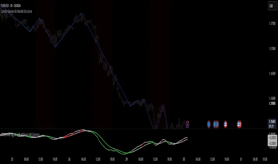
London Session & Market StructureFusion of session indicator with market structure ZigZag line. not my own creation just a fusion of 2 indicators which are publicly available on TV
Enhanced Market Structure StrategyATR-Based Risk Management:
Stop Loss: 2 ATR from entry (configurable)
Take Profit: 3 ATR from entry (configurable)
Dynamic Position Sizing: Based on ATR stop distance and max risk percentage
Advanced Signal Filters:
RSI Filter:
Long trades: RSI < 70 and > 40 (avoiding overbought)
Short trades: RSI > 30 and < 60 (avoiding oversold)
Volume Filter:
Requires volume > 1.2x the 20-period moving average
Ensures institutional participation
MACD Filter (Optional):
Long: MACD line above signal line and rising
Short: MACD line below signal line and falling
EMA Trend Filter:
50-period EMA for trend confirmation
Long trades require price above rising EMA
Short trades require price below falling EMA
Higher Timeframe Filter:
Uses 4H/Daily EMA for multi-timeframe confluence
Enhanced Entry Logic:
Regular Entries: IDM + BOS + ALL filters must pass
Sweep Entries: Failed breakouts with tighter stops (1.6 ATR)
High-Probability Focus: Only trades when multiple confirmations align
Visual Improvements:
Detailed Entry Labels: Show entry, stop, target, and risk percentage
SL/TP Lines: Visual representation of risk/reward
Filter Status: Bar coloring shows when all filters align
Comprehensive Statistics: Real-time performance metrics
Key Strategy Parameters:
pinescript// Recommended Settings for Different Markets:
// Forex (4H-Daily):
// - CHoCH Period: 50-75
// - ATR SL: 2.0, ATR TP: 3.0
// - All filters enabled
// Crypto (1H-4H):
// - CHoCH Period: 30-50
// - ATR SL: 2.5, ATR TP: 4.0
// - Volume filter especially important
// Indices (4H-Daily):
// - CHoCH Period: 50-100
// - ATR SL: 1.8, ATR TP: 2.7
// - EMA and MACD filters crucial
Expected Performance Improvements:
Win Rate: 55-70% (improved filtering)
Profit Factor: 2.0-3.5+ (better risk/reward with ATR)
Reduced Drawdown: Stricter filters reduce false signals
Consistent Risk: ATR-based stops adapt to volatility
This enhanced version provides much more robust signal filtering while maintaining the core market structure edge, resulting in higher-probability trades with consistent risk management.

Larry Williams's Market Structure
Here is a Pine script based on Larry Williams' market structure model.
Note: When processing real-time ticks, heavy calculations can cause script errors. To prevent this, please adjust the script's data range accordingly.
As I'm not an expert in Pine Script, there may be some imperfections. Your understanding is appreciated.
I have great admiration for the wisdom of Larry Williams.
May the trend be with you.

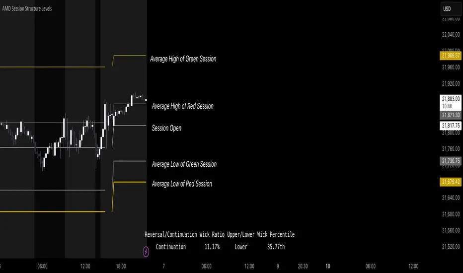
AMD Session Structure Levels# Market Structure & Manipulation Probability Indicator
## Overview
This advanced indicator is designed for traders who want a systematic approach to analyzing market structure, identifying manipulation, and assessing probability-based trade setups. It incorporates four core components:
### 1. Session Price Action Analysis
- Tracks **OHLC (Open, High, Low, Close)** within defined sessions.
- Implements a **dual tracking system**:
- **Official session levels** (fixed from the session open to close).
- **Real-time max/min tracking** to differentiate between temporary spikes and real price acceptance.
### 2. Market Manipulation Detection
- Identifies **manipulative price action** using the relationship between the open and close:
- If **price closes below open** → assumes **upward manipulation**, followed by **downward distribution**.
- If **price closes above open** → assumes **downward manipulation**, followed by **upward distribution**.
- Normalized using **ATR**, ensuring adaptability across different volatility conditions.
### 3. Probability Engine
- Tracks **historical wick ratios** to assess trend vs. reversal conditions.
- Calculates **conditional probabilities** for price moves.
- Uses a **special threshold system (0.45 and 0.03)** for reversal signals.
- Provides **real-time probability updates** to enhance trade decision-making.
### 4. Market Condition Classification
- Classifies market conditions using a **wick-to-body ratio**:
```pine
wick_to_body_ratio = open > close ? upper_wick / (high - low) : lower_wick / (high - low)
```
- **Low ratio (<0.25)** → Likely a **trend day**.
- **High ratio (>0.25)** → Likely a **range day**.
---
## Why This Indicator Stands Out
### ✅ Smarter Level Detection
- Uses **ATR-based dynamic levels** instead of static support/resistance.
- Differentiates **manipulation from distribution** for better decision-making.
- Updates probabilities **in real-time**.
### ✅ Memory-Efficient Design
- Implements **circular buffers** to maintain efficiency:
```pine
var float manipUp = array.new_float(lookbackPeriod, 0.0)
var float manipDown = array.new_float(lookbackPeriod, 0.0)
```
- Ensures **constant memory usage**, even over extended trading sessions.
### ✅ Advanced Probability Calculation
- Utilizes **conditional probabilities** instead of simple averages.
- Incorporates **market context** through wick analysis.
- Provides **actionable signals** via a probability table.
---
## Trading Strategy Guide
### **Best Entry Setups**
✅ Wait for **price to approach manipulation levels**.
✅ Confirm using the **probability table**.
✅ Check the **wick ratio for context**.
✅ Enter when **conditional probability aligns**.
### **Smart Exit Management**
✅ Use **distribution levels** as **profit targets**.
✅ Scale out **when probabilities shift**.
✅ Monitor **wick percentiles** for confirmation.
### **Risk Management**
✅ Size positions based on **probability readings**.
✅ Place stops at **manipulation levels**.
✅ Adjust position size based on **trend vs. range classification**.
---
## Configuration Tips
### **Session Settings**
```pine
sessionTime = input.session("0830-1500", "Session Hours")
weekDays = input.string("23456", "Active Days")
```
- Match these to your **primary trading session**.
- Adjust for different **market opens** if needed.
### **Analysis Parameters**
```pine
lookbackPeriod = input.int(50, "Lookback Period")
low_threshold = input.float(0.25, "Trend/Range Threshold")
```
- **50 periods** is a good starting point but can be optimized per instrument.
- The **0.25 threshold** is ideal for most markets but may need adjustments.
---
## Market Structure Breakdown
### **Trend/Continuation Days**
- **Characteristics:**
✅ Small **opposing wicks** (minimal counter-pressure).
✅ Clean, **directional price movement**.
- **Bullish Trend Day Example:**
✅ Small **lower wicks** (minimal downward pressure).
✅ Strong **closes near the highs** → **Buyers in control**.
- **Bearish Trend Day Example:**
✅ Small **upper wicks** (minimal upward pressure).
✅ Strong **closes near the lows** → **Sellers in control**.
### **Reversal Days**
- **Characteristics:**
✅ **Large opposing wicks** → Failed momentum in the initial direction.
- **Bullish Reversal Example:**
✅ **Large upper wick early**.
✅ **Strong close from the lows** → **Sellers failed to maintain control**.
- **Bearish Reversal Example:**
✅ **Large lower wick early**.
✅ **Weak close from the highs** → **Buyers failed to maintain control**.
---
## Summary
This indicator systematically quantifies market structure by measuring **manipulation, distribution, and probability-driven trade setups**. Unlike traditional indicators, it adapts dynamically using **ATR, historical probabilities, and real-time tracking** to offer a structured, data-driven approach to trading.
🚀 **Use this tool to enhance your decision-making and gain an objective edge in the market!**
Market Structure MA Based BOS [liwei666]
🎲 Overview
🎯 This BOS(Break Of Structure) indicator build based on different MA such as EMA/RMA/HMA, it's usually earlier than pivothigh() method
when trend beginning, customer your BOS with 2 parameters now.
🎲 Indicator design logic
🎯 The logic is simple and code looks complex, I‘ll explain core logic but not code details.
1. use close-in EMA's highest/lowest value mark as SWING High/Low when EMA crossover/under,
not use func ta.pivothigh()/ta.pivotlow()
2. once price reaching EMA’s SWING High/Low, draw a line link High/Low to current bar, labled as BOS
3. find regular pattern benefit your trading.
🎲 Settings
🎯 there are 4 input properties in script, 2 properties are meaningful in 'GRP1' another 2 are display config in 'GRP2'.
GRP1
MA_Type: MA type you can choose(EMA/RMA/SMA/HMA), default is 'HMA'.
short_ma_len: MA length of your current timeframe on chart
GRP2
show_short_zz: Show short_ma Zigzag
show_ma_cross_signal: Show ma_cross_signal
🎲 Usage
🎯 BOS signal usually worked fine in high volatility market, low volatility is meaningless.
🎯 We can see that it performs well in trending market of different symbols, and BOS is an opportunity to add positions
BINANCE:BTCUSDTPERP
BINANCE:ETHUSDTPERP
🎯 MA Based signal is earlier than pivothigh()/pivotlow() method when trend beginning. it means higher profit-loss rate.
🎯 any questions or suggestion please comment below.
Additionally, I plan to publish 20 profitable strategies in 2023; indicatior not one of them,
let‘s witness it together!
Hope this indicator will be useful for you :)
enjoy! 🚀🚀🚀
